
Start with the L
The first L establishes the base geometric shape.
 REI KONG
LiftLab · Academic team capstone · 2026
An academic team capstone creating a Shopify wellness storefront for everyday supplements.
Visual Designer, academic team
Identity, homepage wireframe and exit popup
Shopify

The project
LiftLab was an academic group project. During discussion, the team identified growing interest in health products and chose to create a Shopify wellness storefront for supplements.
The storefront uses a focused product range, clear product benefits and a consistent visual system to make the experience feel simple to navigate.
My contribution
I was responsible for:
These choices were designed to make the storefront feel premium, help customers find a suitable product quickly and guide them towards purchase.
01. Visual identity
The logo uses a lightning bolt between the two L forms. Black and lime green create a premium system with a clear point of focus.
The first L establishes the base geometric shape.

A second L introduces motion.

The overlapping inner edges are carved into a lightning bolt detail.

The completed symbol is designed to stay recognisable at small sizes.


02. Product imagery
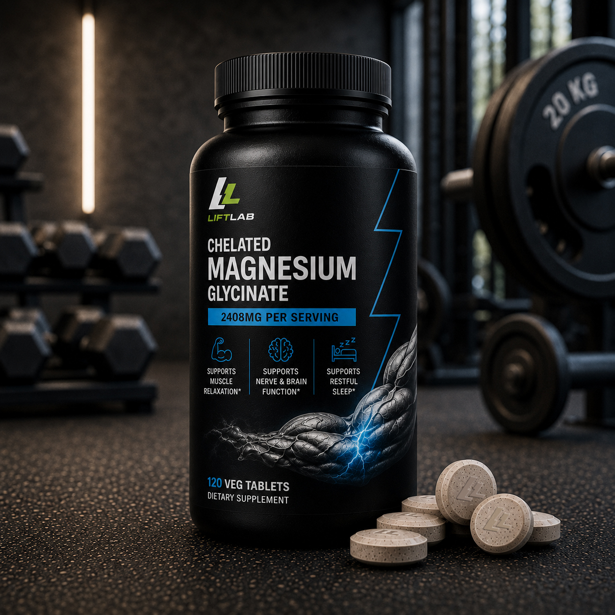
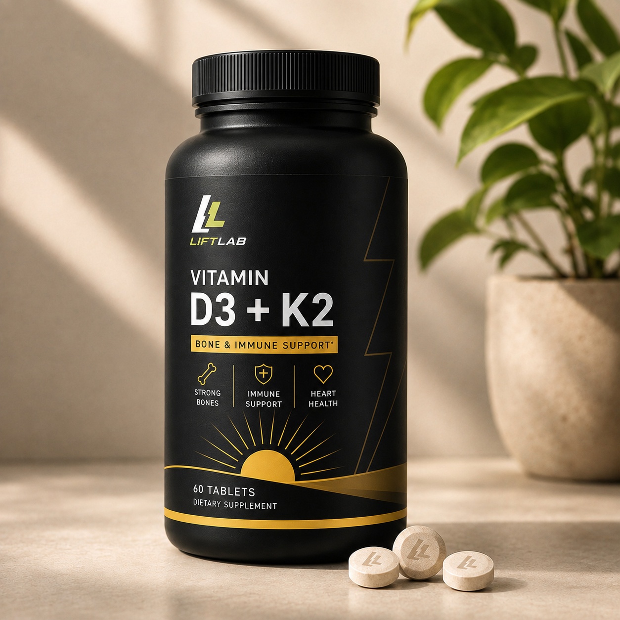
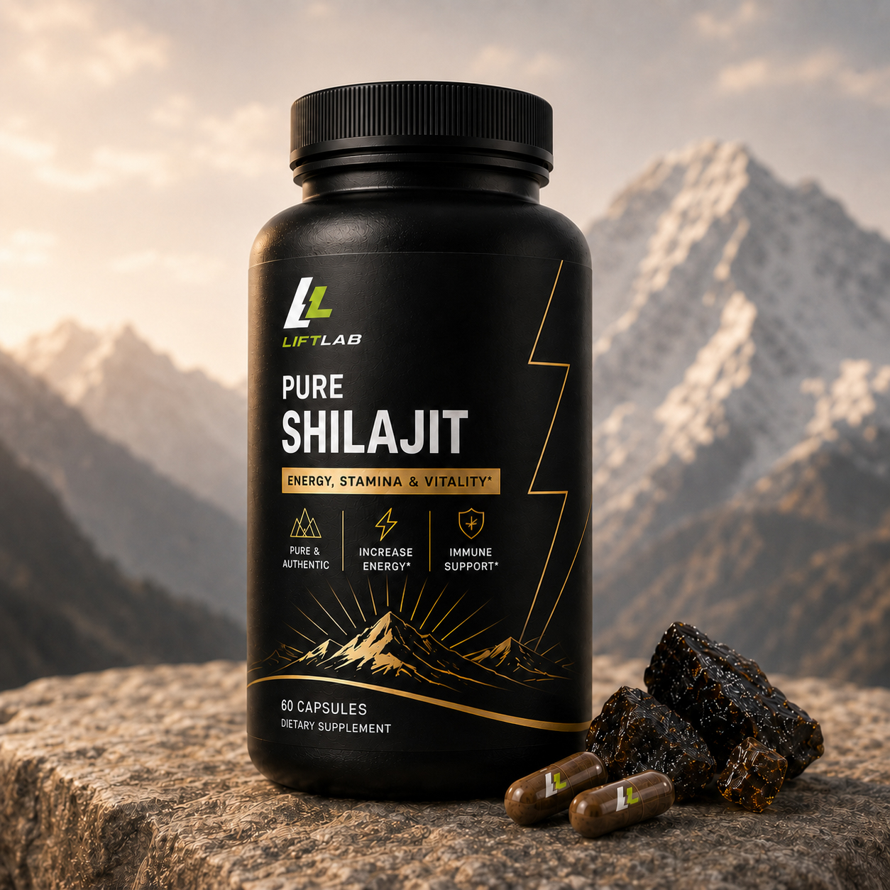
Each product visual will pair the supplement with a clear, relevant setting, helping customers understand its role before reading the full product description. The lightning bolt detail from the logo is also used on the packaging, linking the product range back to the LiftLab identity.
03. Rotating homepage banners
Each banner gives a different supplement its own setting and message, while keeping a consistent campaign structure: product label, bold headline, benefit list and call to action.


04. Content and discoverability
Each page has a clear job. Product pages use imagery focused on product benefits and simple information to make product choice easier. The About Us page builds trust, the FAQ answers common questions, and blog articles offer useful wellness content.
Together, these pages help people find and understand LiftLab, while supporting SEO, AEO and GEO.
05. Storefront in use
I created the homepage wireframe to guide visitors from discovery to purchase. Featured products make the range easy to scan, while the “What Are You Looking to Support?” section helps customers find a product by wellness goal.
“We Do Things Differently” explains what sets LiftLab apart, and customer reviews add social proof. I also built the exit popup to encourage email signups before visitors leave.
Click to open a larger, scrollable version.
Click to open a larger version.
Project credit
Academic team capstone. I designed the LiftLab logo, colour system and homepage wireframe, then used AI to create the product imagery and most homepage sections. I also built the exit popup.