 REI KONG
Jetstar · 2025
Making an evolving brand work across Southeast Asia.
A regional rollout applying Jetstar’s Take Off More platform and global brand refresh across campaigns, languages and platforms.
Regional Visual Designer
BAU, ad hoc and campaign creative across digital, print and physical touchpoints
9 Singapore route markets
Context
A global refresh for an established return to travel.
Nearly two years after travel resumed following the pandemic, Jetstar began refreshing its global brand. While the global direction was still developing, the Southeast Asia team needed to bring live campaigns to market across multiple countries.
The challenge was to work with the guidance and assets available, while creating materials that felt consistent and practical for regional use.
My contribution
I translated the available brand direction into usable regional work.
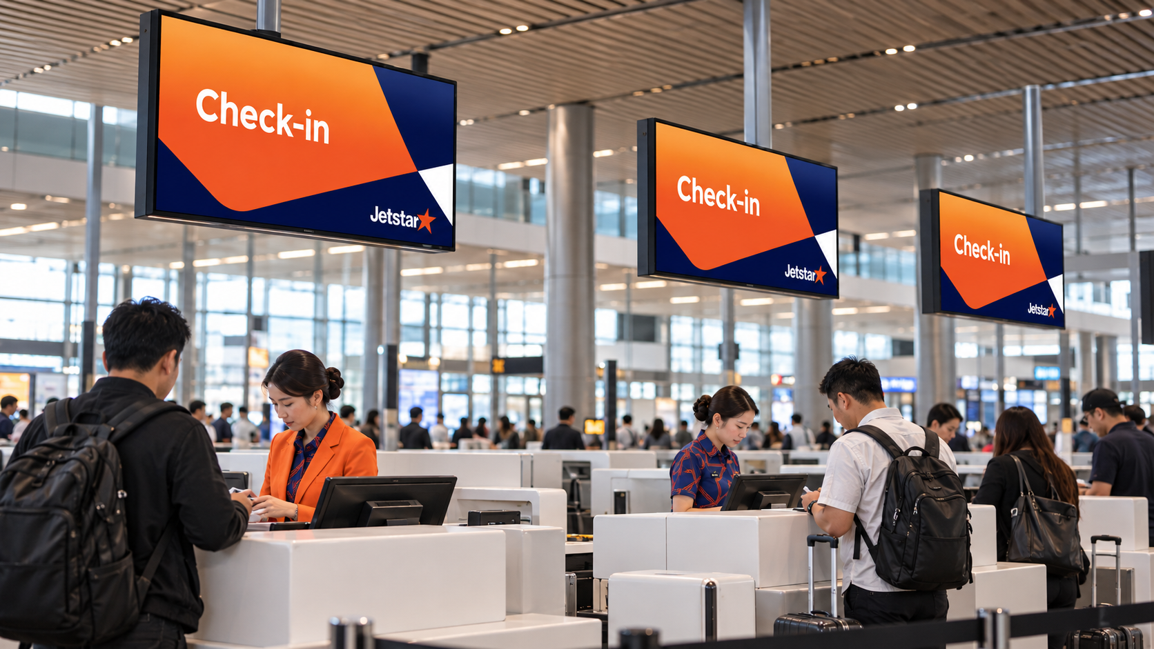
I supported nine Jetstar Singapore route markets, delivering BAU, ad hoc and thematic sale creative across digital, print and physical formats. This included image sourcing, key visuals, homepage banners, check-in screens, EDMs, display, social and out-of-home.
I worked with regional marketing teams and the Australian design team to make each market version locally appropriate and ready for brand approval.
01. Global brand device
A flexible device built from Jetstar’s star.
The Jetstar star was deconstructed into six parts: a central core and five outer points. These components could be used individually or paired together as flexible brand elements across campaign frames and layouts. Navy blue was introduced alongside Jetstar orange to echo the sky and give the campaign system more depth, contrast and flexibility across different applications.

Jetstar brand asset

Six elements


Crew uniform pattern
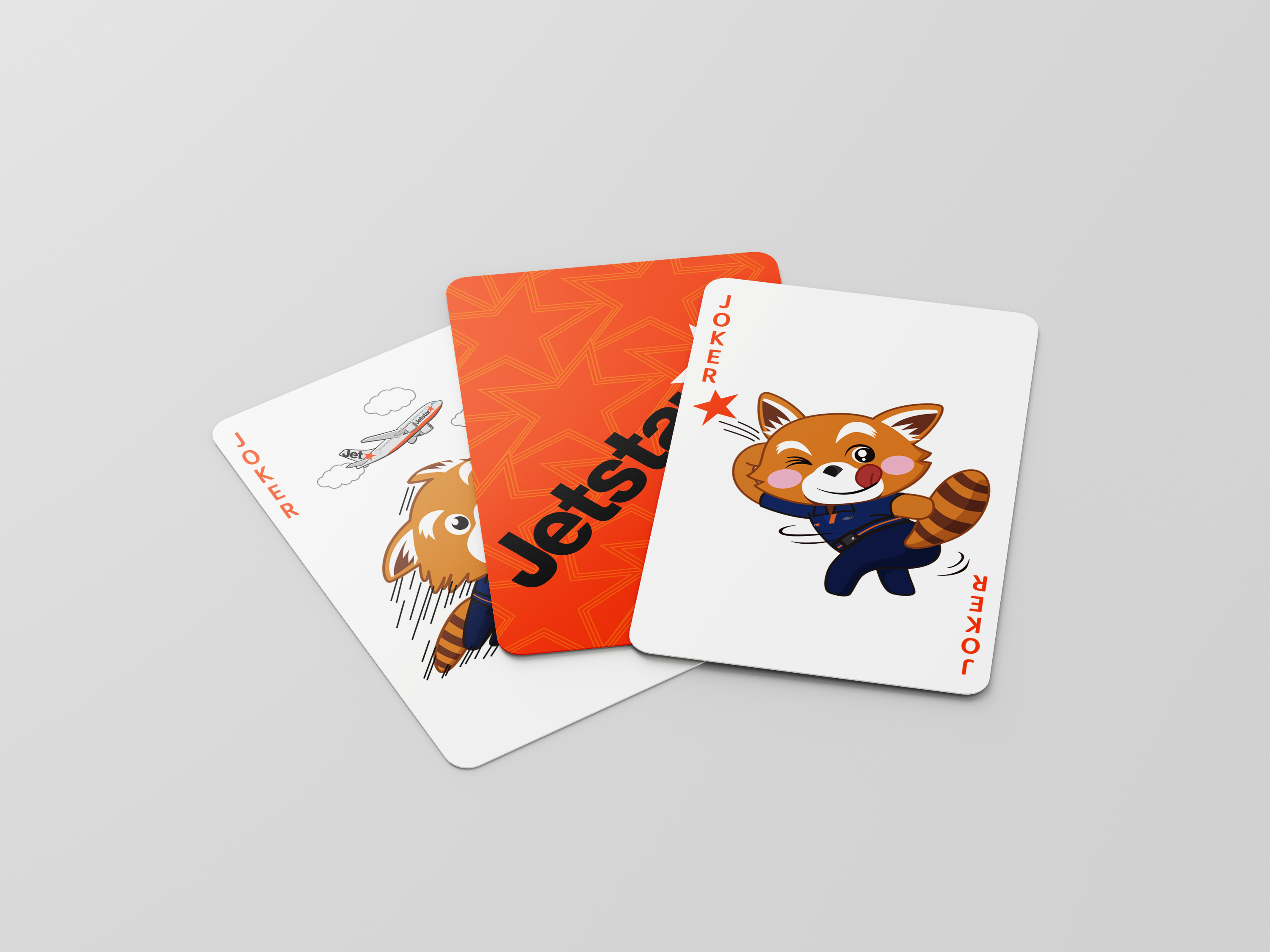
A repeating pattern developed for the crew uniforms also extended to selected printed touchpoints, including notebooks and playing cards, as a subtle supporting detail.
02. Across markets and formats
Regional rolloutThe same evolving visual direction was applied across campaign assets for different markets, languages and channels.
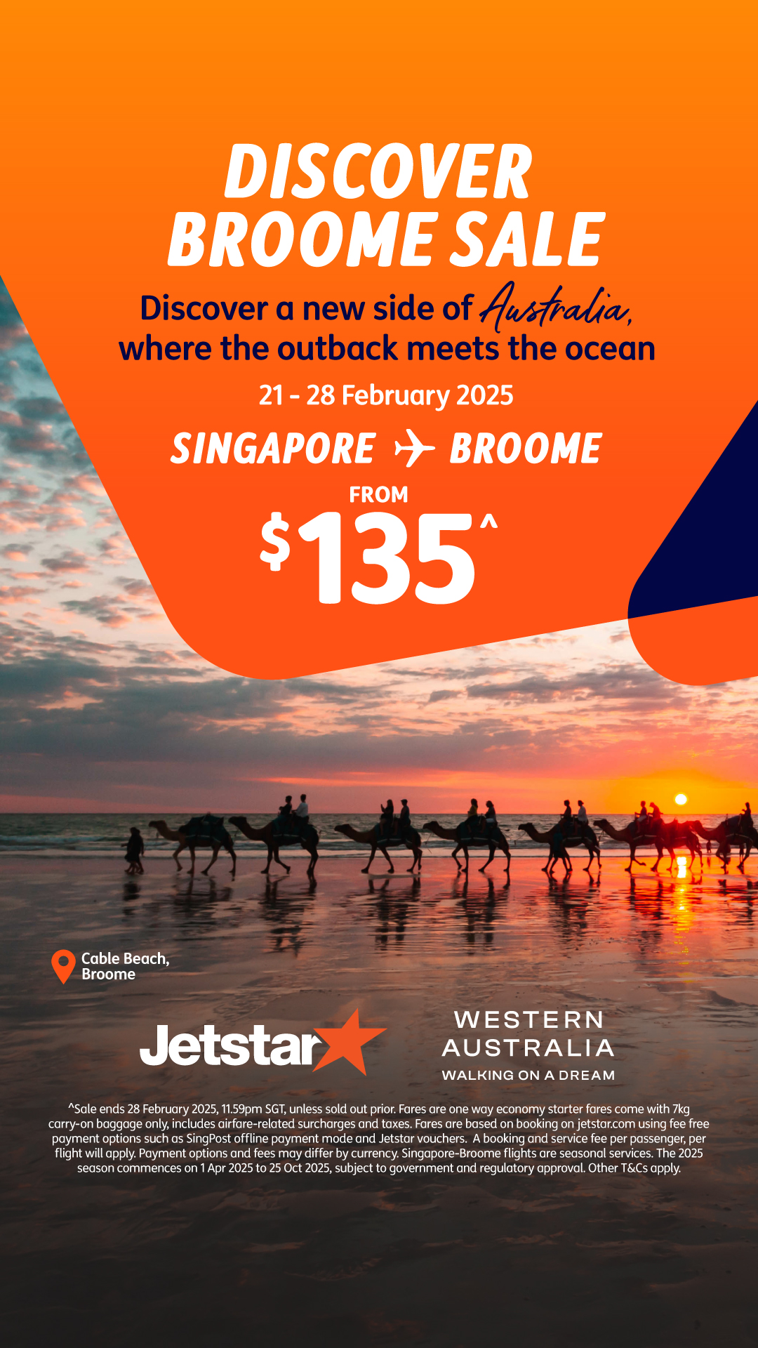
Singapore to Broome campaign

Taipei to Tokyo / Osaka campaign
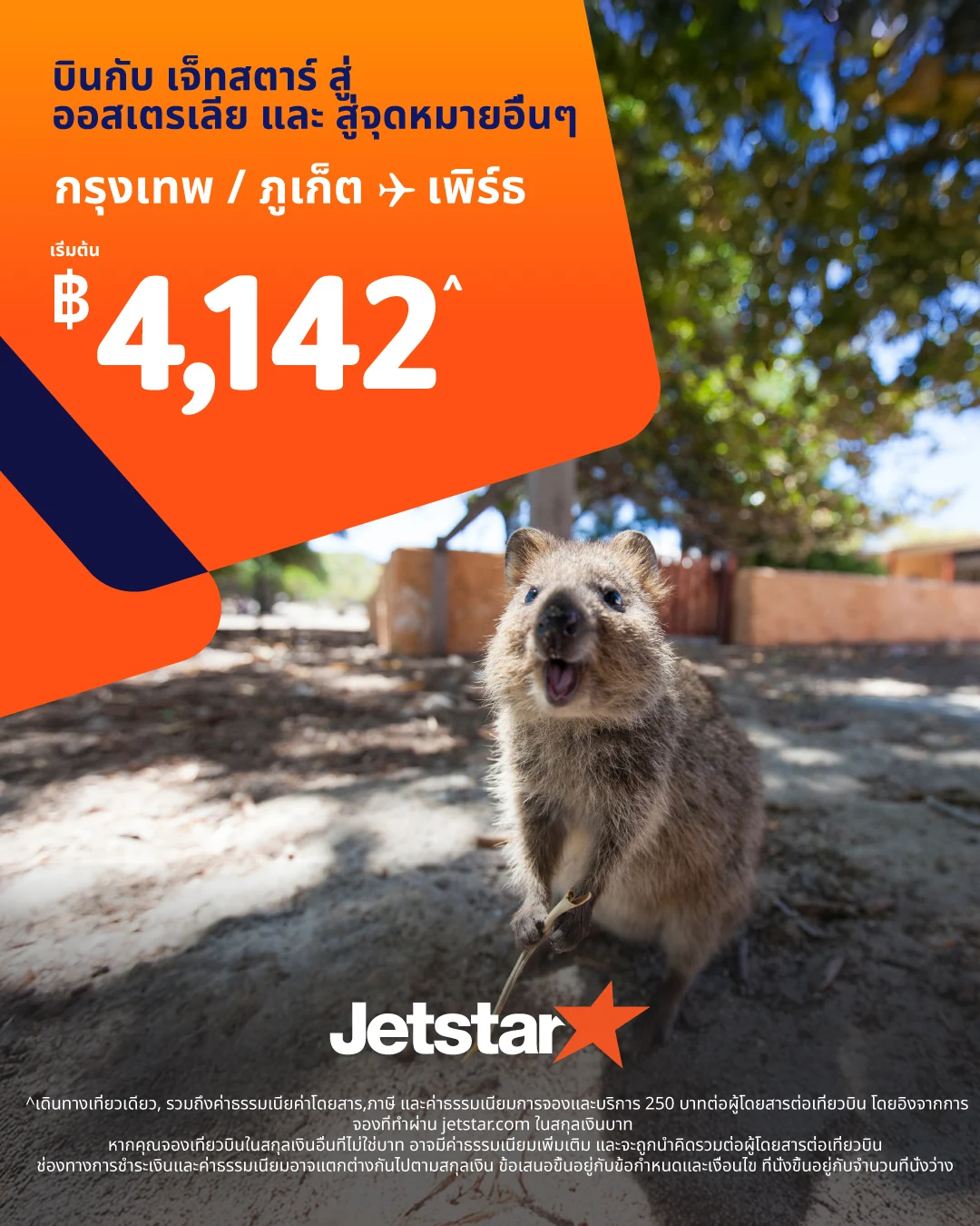
Bangkok / Phuket to Perth campaign
03. More applications
Across different formats and touchpoints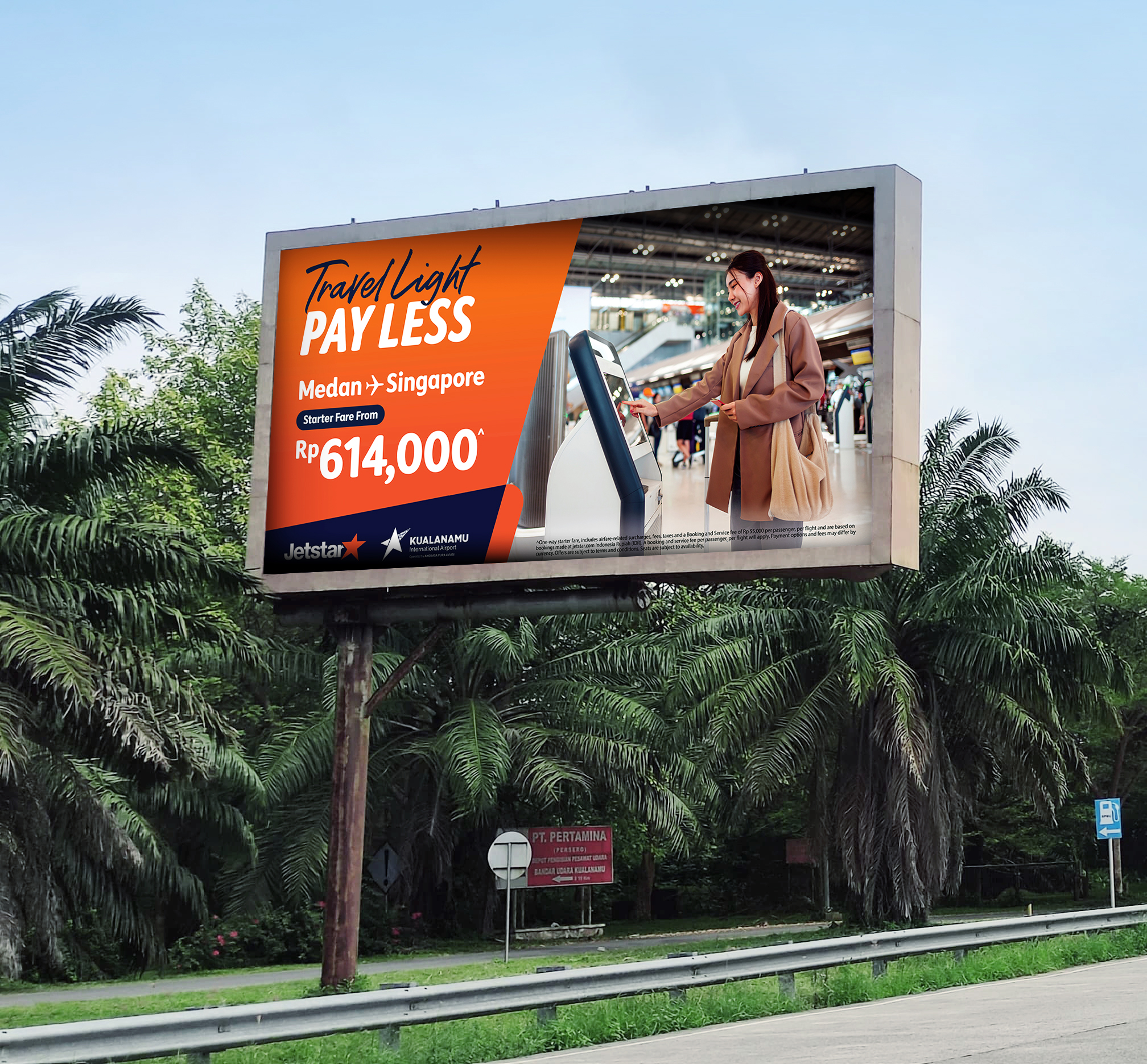
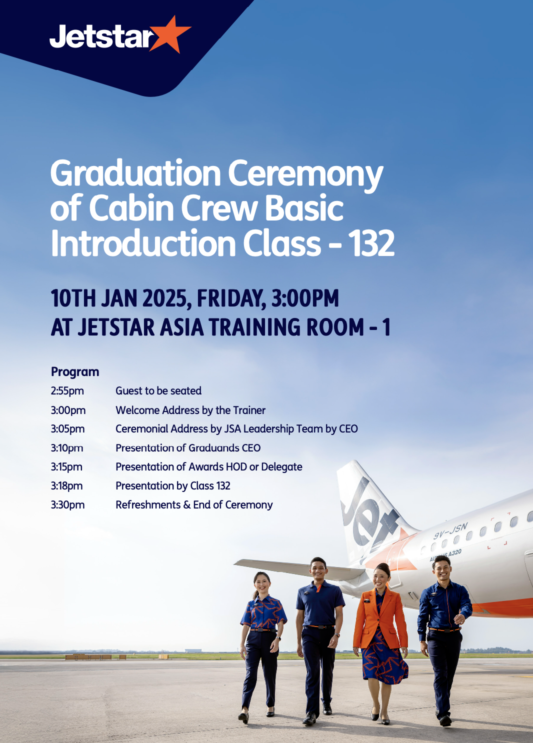
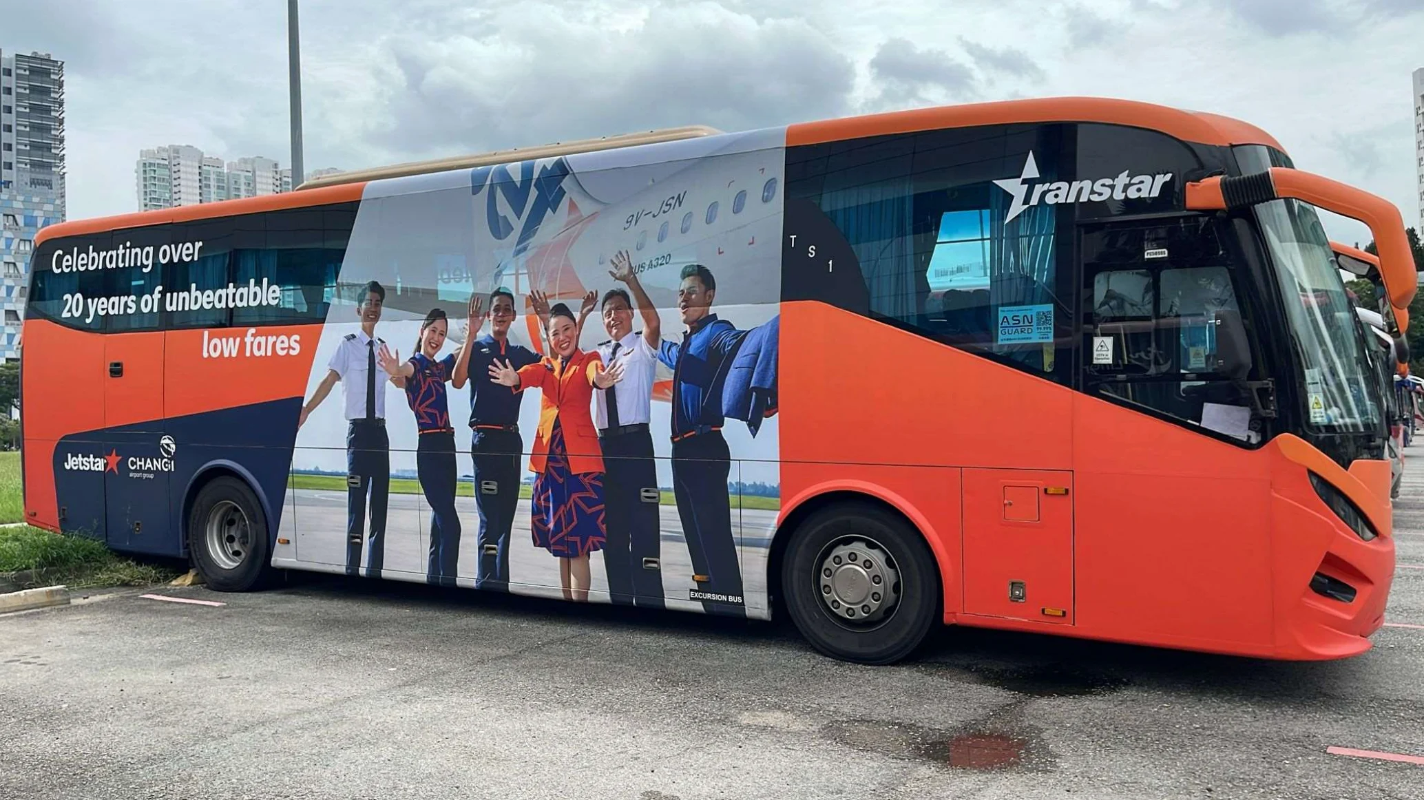
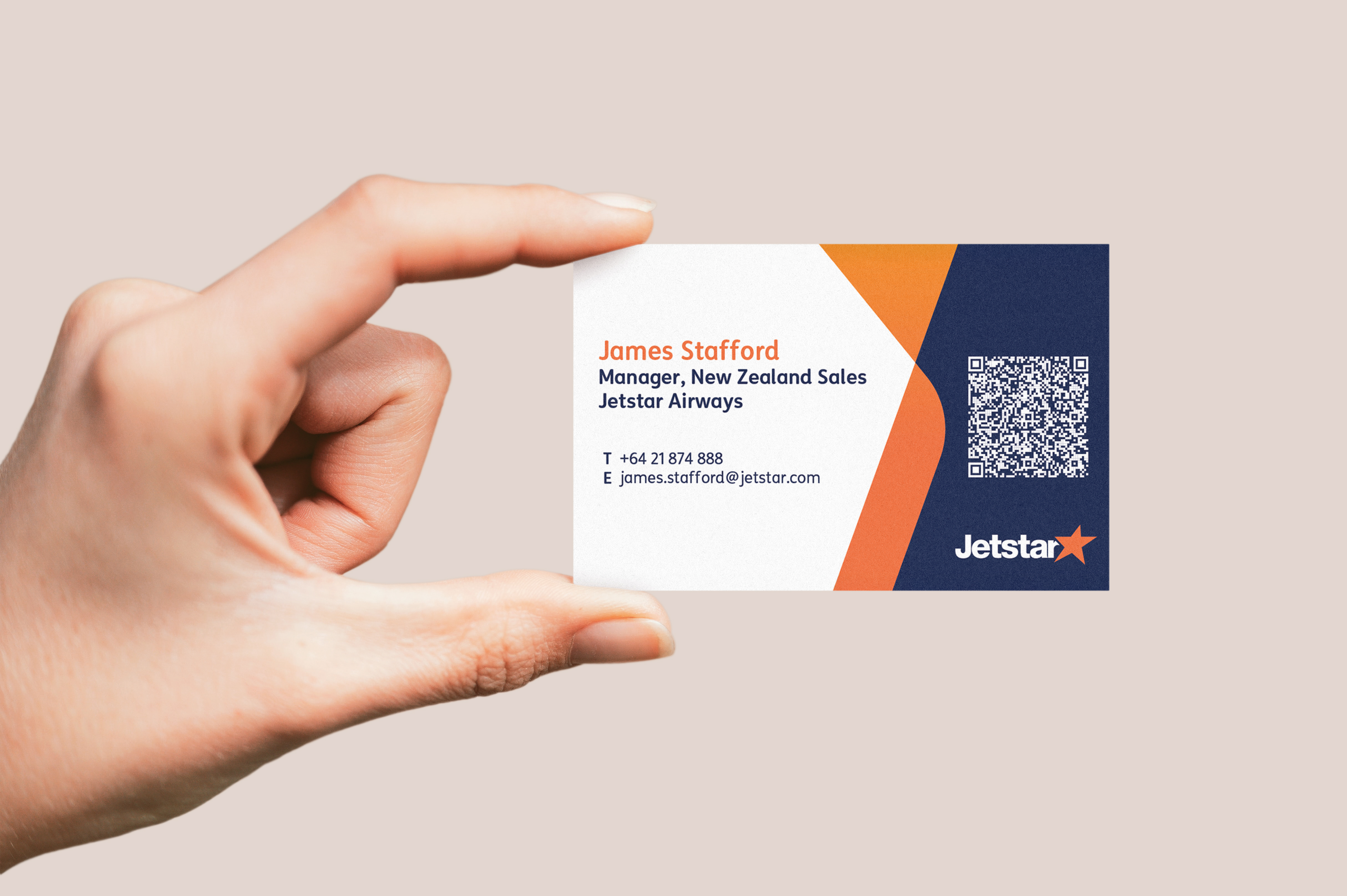
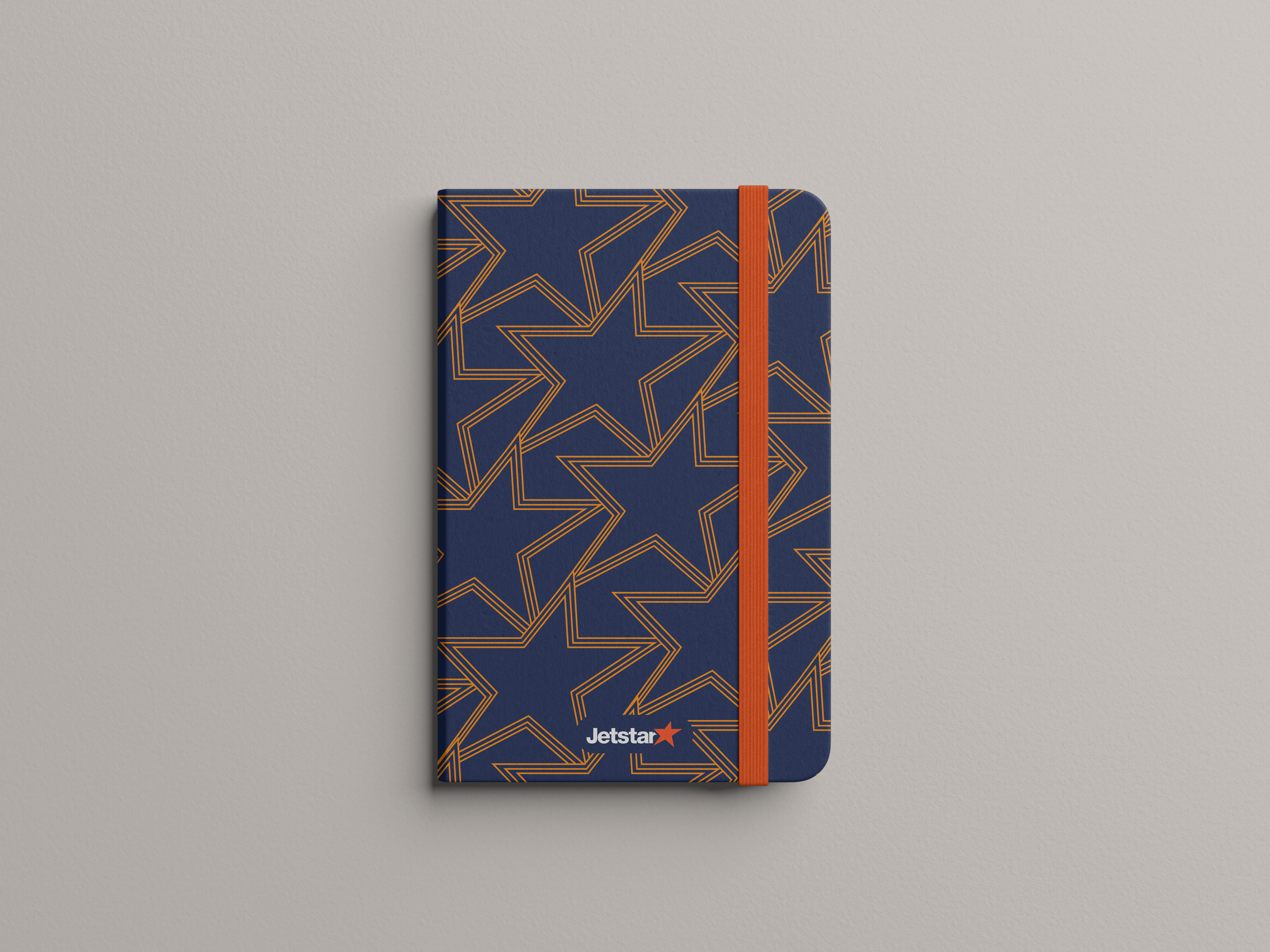
Project credit
Created as part of the Jetstar Southeast Asia team. I applied the evolving global brand direction across regional campaign rollouts.